
Understanding Flutter's Responsive Code: A Deep Dive
- James Armstrong

- Aug 11, 2024
- 3 min read
A significant issue often overlooked by developers, and one I’ve personally encountered multiple times, is the failure to fully leverage Flutter's cross-platform capabilities. Many developers treat the designs provided by the UI/UX team as immutable, sticking rigidly to the fixed sizes of widgets and text as specified. This narrow-minded implementation approach tends to unravel when the app is tested on devices with resolutions different from those used during the initial UI/UX design phase. The result is a rapid decline in usability, leading to last-minute scrambles to address what should be simple, avoidable issues.
To effectively create a responsive app in Flutter, it’s crucial first to understand the distinction between responsive and adaptive design. An easy way to conceptualise this is to think of responsive design as adapting the UI to fit within the given space, whereas adaptive design is about ensuring the UI is fully usable within that space. For instance, a responsive app dynamically adjusts the placement of design elements to fit the available screen size. In contrast, an adaptive app goes a step further, selecting the most appropriate layout and input methods to ensure usability on the specific device. A practical example could be whether a tablet UI should utilise bottom navigation or switch to a side-panel navigation to maximise usability.
A truly skilled developer must look beyond the initial design provided by the UI/UX team. If the designs do not account for different devices—such as tablets, varying screen orientations, or a broad range of mobile phones—it falls upon the developer to apply their expertise to create a responsive app. Failing to adapt the design to accommodate these variations is, in this author’s opinion, a clear indicator of a lack of professional standards.
So, how exactly do we go about developing a responsive app, and what level of effort does this entail? The answer is surprisingly simple. As with many challenges in Flutter, there are numerous packages available that can address these issues efficiently. Personally, I’ve found the Sizer package to be highly effective and have used it several times. While I will detail the simplicity of its implementation, it’s important to note that this is not the only method, nor necessarily the best one—it’s simply the approach I have the most experience with and can vouch for.
The all starts with a simple widget wrapped about the Material App.
return Sizer(
builder: (context, orientation, deviceType) {
return MaterialApp(
debugShowCheckedModeBanner: false,
title: 'Sizer',
theme: ThemeData.light(),
home: HomeScreen() ,
);
},
);
This ensures that within the application, we can work with percentages rather than fixed numbers.
When given a design with fixed measurements, it’s important as developers to convert those values into percentages.
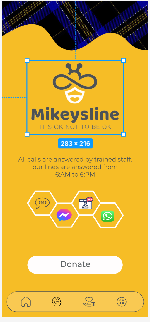
For example, the design places the logo in a container with fixed dimensions of 283 x 216. This is fine if the device remains the same; in this case, the design is based on a 428 x 926 screen (iPhone 14 Plus).
The solution is straightforward, as are the calculations: the container occupies 66% of the screen's width and 23% of its height.
To calculate the width as a percentage, simply divide 283 by 428, which equals 0.66 or 66%. The same method applies to the height: 216 divided by 926 equals 0.23, or 23%.
Now, when we use a container to display the logo as a decoration, we can set its dimensions as follows:
Container(
width: 66.0.w,
height: 23.0.h,
)
For text, we move from percentage-based height and width to using the device's pixel density and aspect ratio, applied as follows:
Text(
'Sizer',
style: TextStyle(fontSize: 15.sp),
)
It really is that simple. This approach will allow your app to use percentages, adjusting widget layouts and text display to maintain the designer’s vision across all devices.
Conclusion:
By adopting a percentage-based approach to design elements within your Flutter app, you ensure a consistent user experience across various devices. Converting fixed measurements into responsive percentages allows your application to adapt seamlessly, preserving the original design's intent regardless of screen size or resolution. This simple yet effective method guarantees that your app looks and functions as intended on any device, making it a crucial practice for developers aiming to deliver high-quality, cross-platform applications.


Comments